TEDxEwha is an independently organized community that carries forward TED’s mission of sharing “Ideas Worth Spreading” at Ewha. We seek to foster dialogue and exchange across technology, entertainment, design, and beyond. To bring these ideas to a wider audience, sixteen Ewha members from diverse majors and backgrounds have come together to create a platform for open communication and inspiration.
TEDxEwha는 '알릴 가치가 있는 아이디어(Ideas Worth Spreading)'를 전파하고자 하는 TED의 목표를 이화에서 이어받아 기술, 엔터테인먼트, 디자인, 그리고 그 너머의 다양한 가치를 나누기 위해 구성된 강연 기획 단체입니다. '알릴 가치가 있는 아이디어'를 더욱 널리 전파하기 위해 전공, 학번을 불문하고 다양한 열정을 가진 16명의 이화인들이 자유로운 소통의 장을 만들고자 합니다.
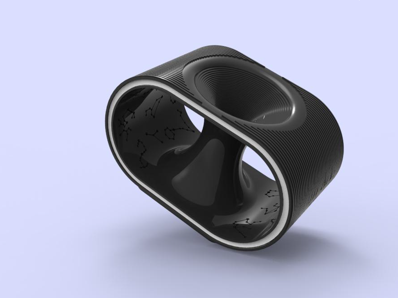
Intermission
COVID-19 has placed a heavy weight on all our steps. For young people just starting out in society—those who must gain experience and prepare for the future—the burden has been even greater. They say that simply “holding their ground” feels overwhelming after pushing themselves forward to find their place. At TEDxEwha, we hope to reframe this period we are going through—not as “stagnation,” but as a much-needed “pause for rest.”
코로나는 우리 모두의 발걸음에 무거운 추를 달았습니다. 많은 것을 경험하고 미래를 위해 준비해야 하는 사회 초년생에게는 더욱 그렇습니다. 사회에서 제 몫을 하기 위해 바쁜 걸음을 옮겨온 그들은 '그 자리에 버티고 있는 것만으로도 버겁다'고 말합니다. TEDxEwha는 우리가 겪고 있는 이 시기를 '정체'가 아닌 '휴식'으로 전환해 보려 합니다.
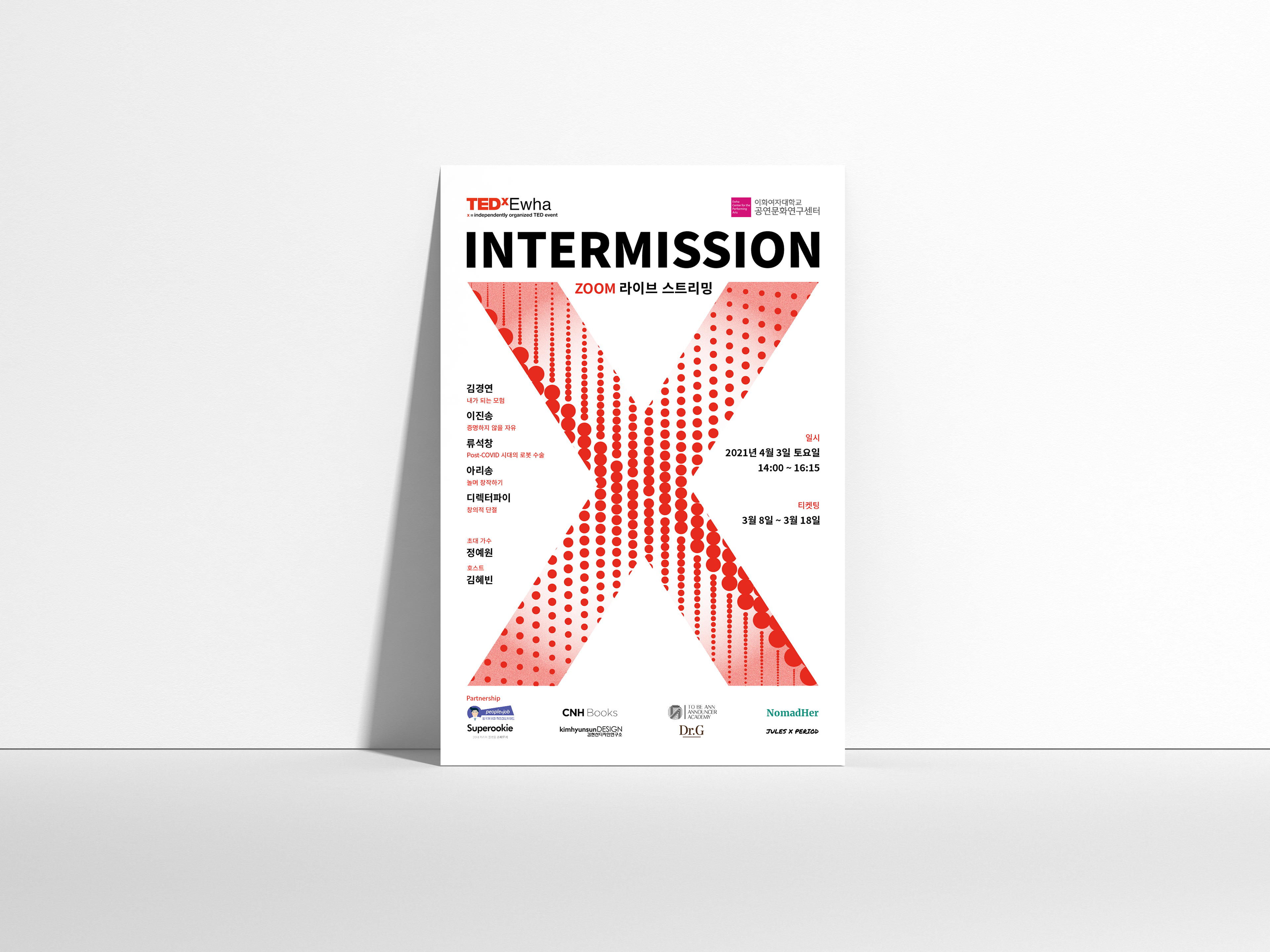
Poster
Using TED’s official red logo color and the “X” motif of TEDx, we visualized the theme “Intermission” through a pointillism technique. The red dots converge to form linear shapes, symbolizing individuals coming together and striving to communicate with one another.
TED의 공식 로고 컬러인 레드와 TEDx에 X모양을 가져와 "Intermission(휴식)" 이라는 주제를 점이 기법을 통해 표현하였습니다. 붉은 점들이 모여 선의 형태가 보이는 모습은 서로 소통하려는 우리 개개인의 모습을 나타냅니다.
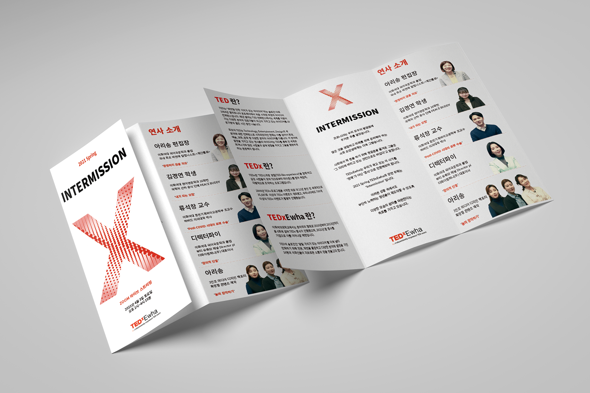
Leaflet
Based on the main poster’s graphic design, we created a leaflet to share with participants and partners. It introduces TED, TEDx, and TEDxEwha, delivers our core message, and provides details on the speakers, host, guest performer, co-organizers, partners, and contact information. By applying the main colors—red and monochrome—we placed strong emphasis on readability and clarity.
메인 포스터의 그래픽 이미지를 사용하여 관계자 분들에게 나눠드릴 리플렛을 제작했습니다. TED, TEDx, TEDxEwha가 무엇인지에 대한 소개와, 전하고픈 메세지, 연사 소개와 호스트, 초대 가수 소개, 마지막으로 공동주관과 협력사, 연락처를 보기 쉽게 담아내려 했습니다. 메인 컬러인 레드와 모노톤을 활용하여 가독성을 높이는데 집중했습니다.
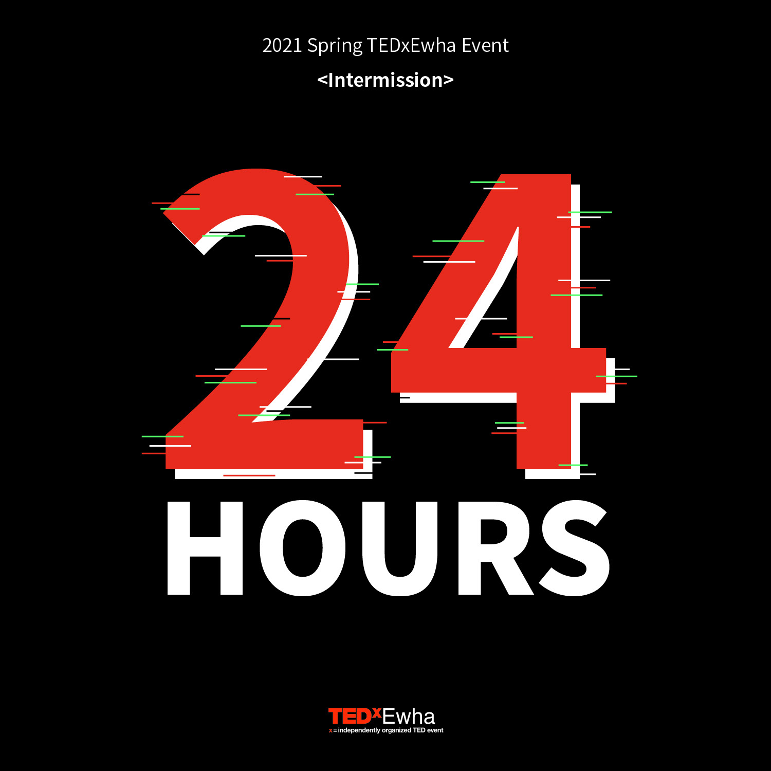
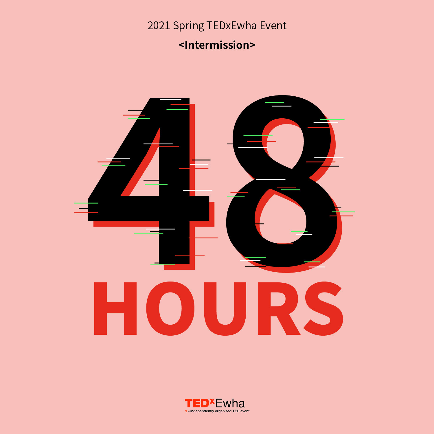
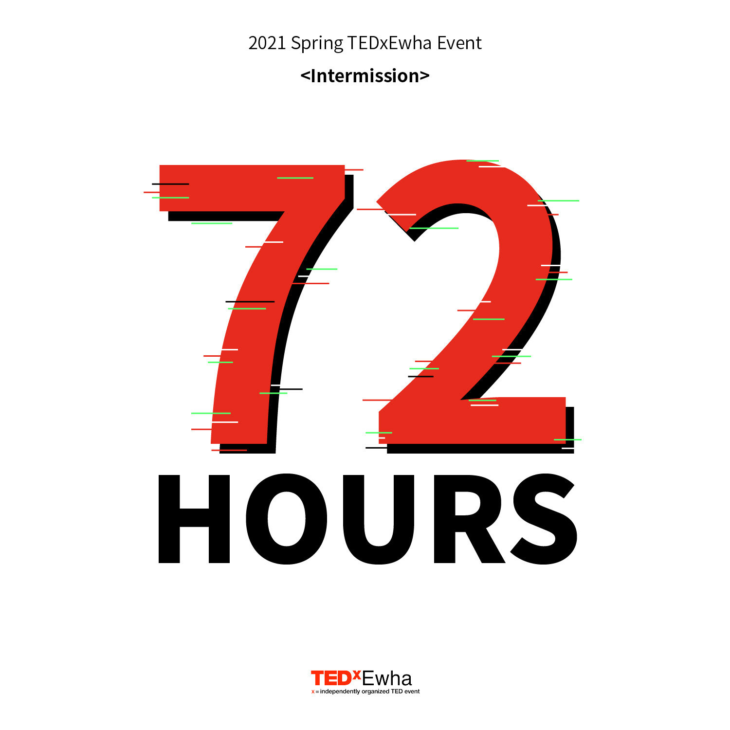
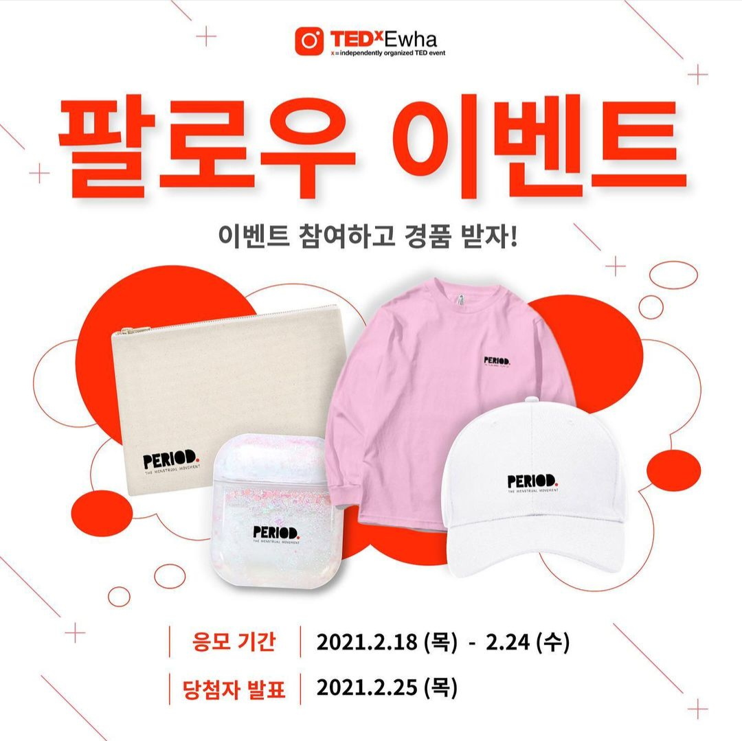

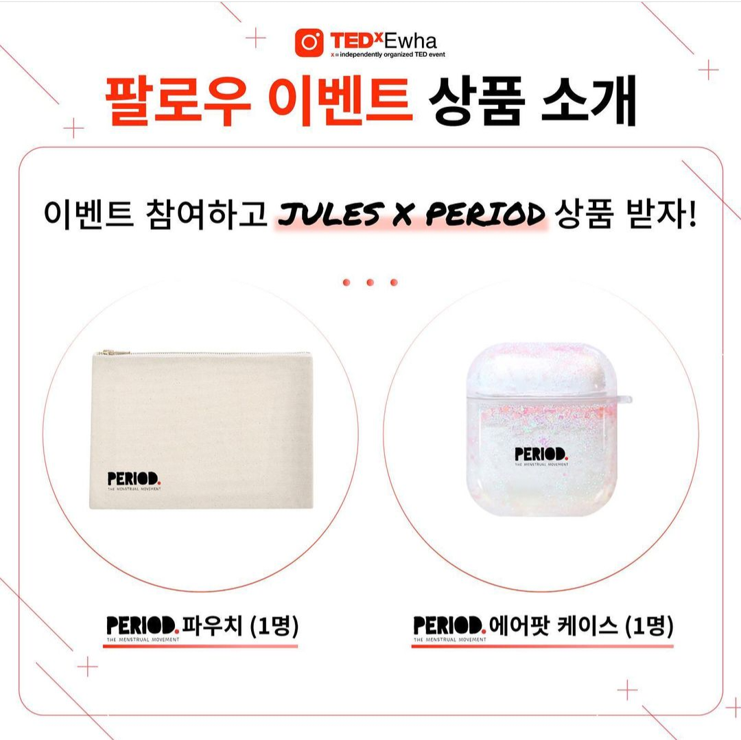
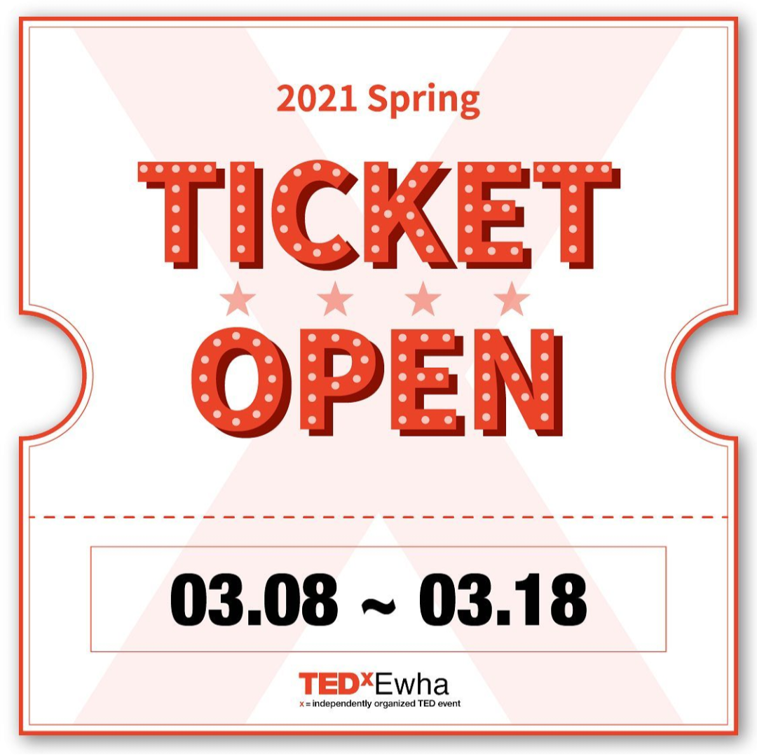
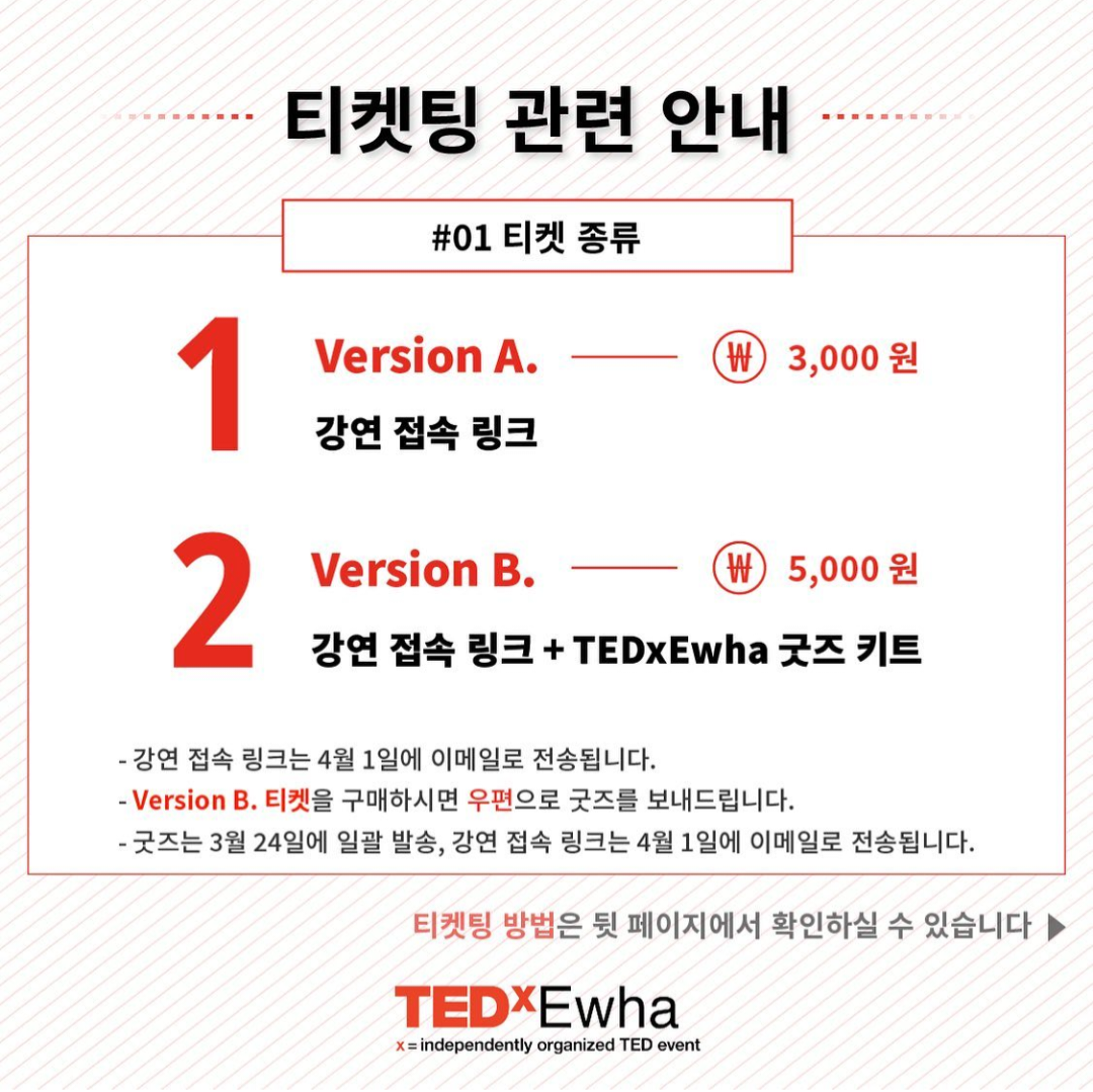
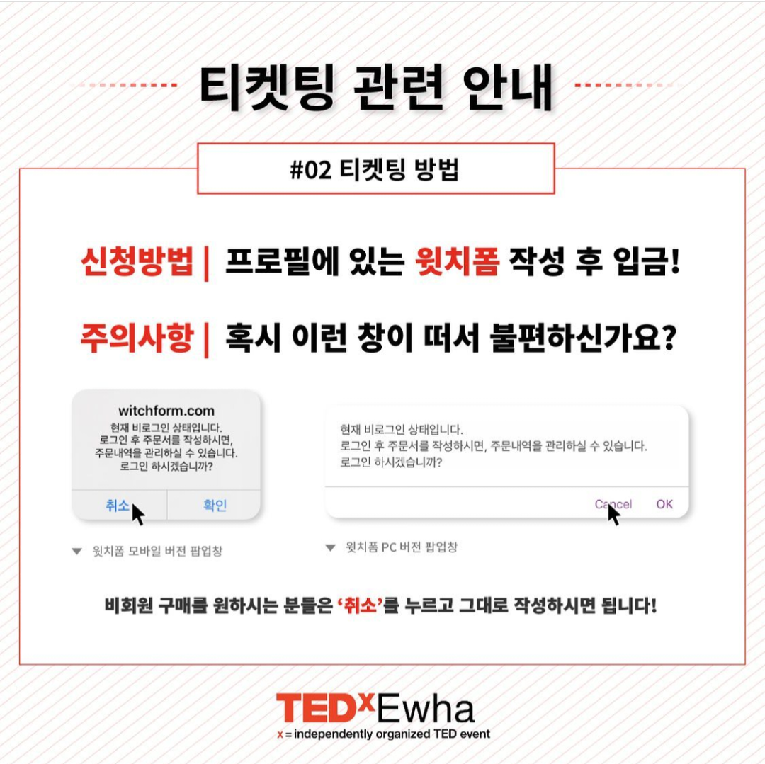
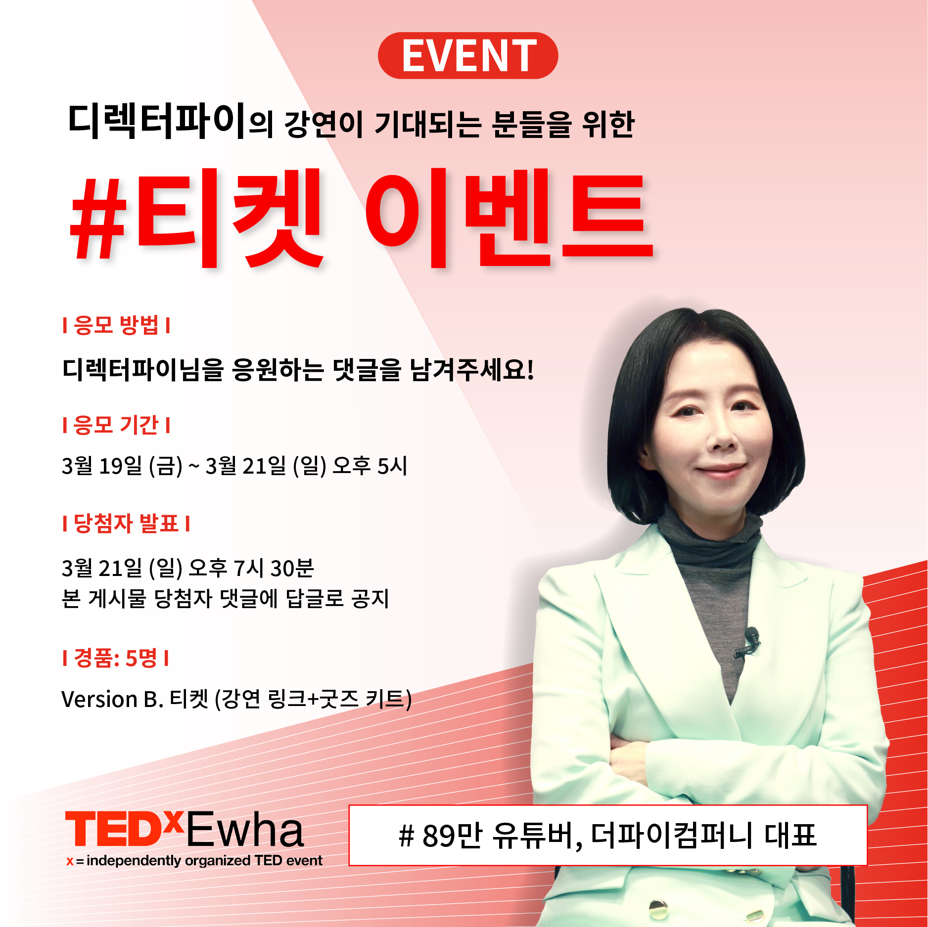
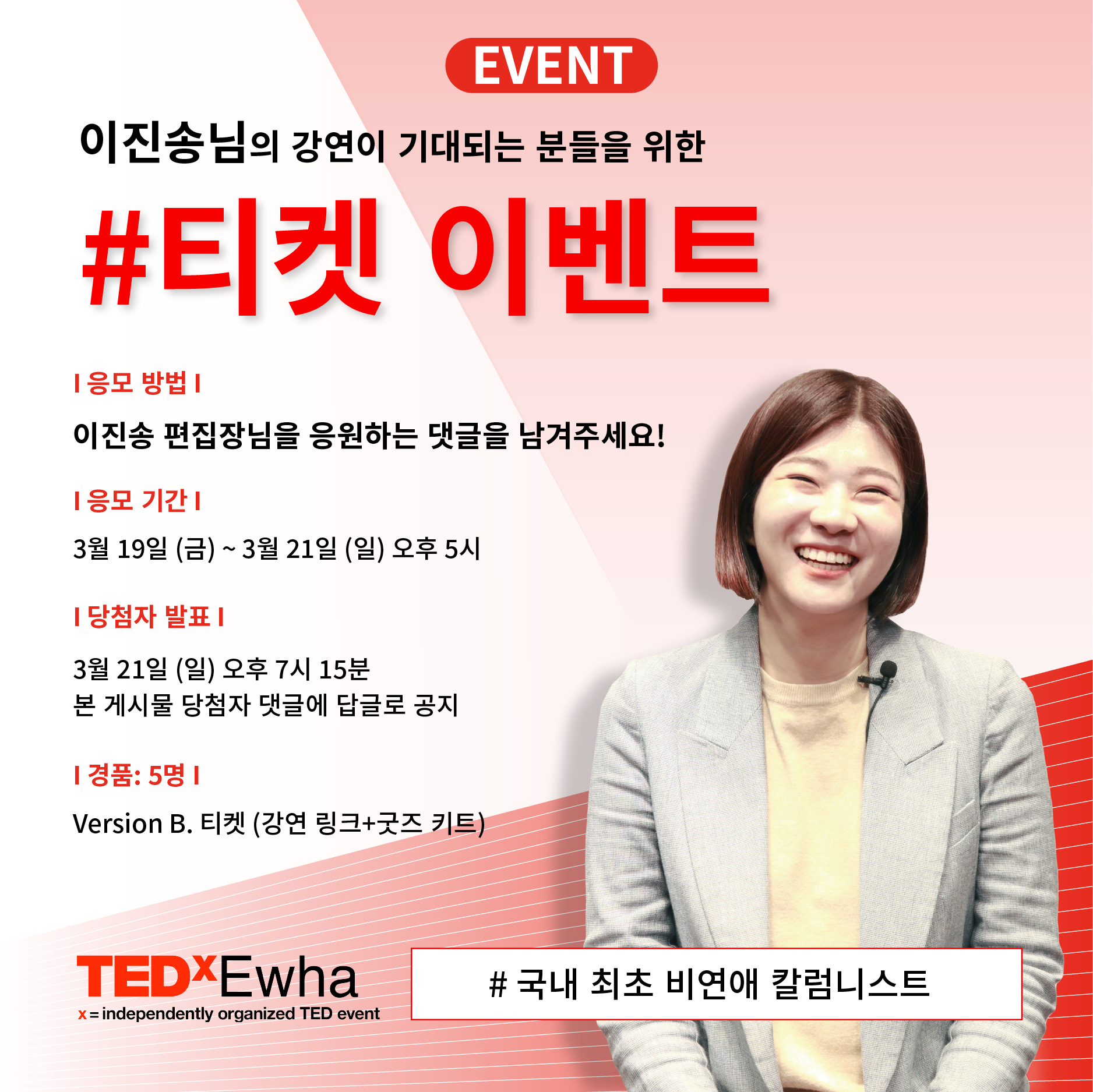
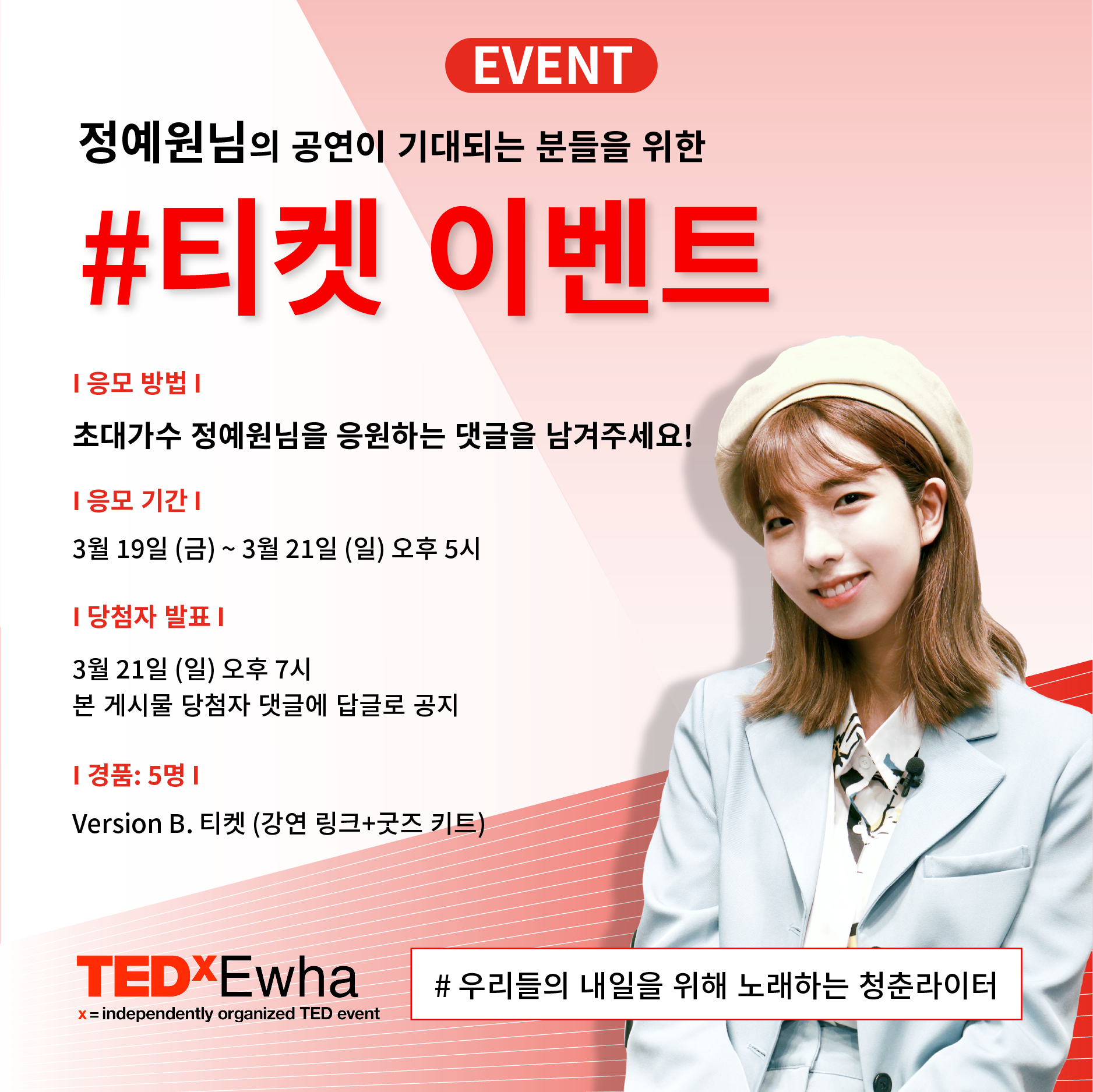
SNS Contents
Following a unified visual style guide, we developed various online contents such as D-day countdowns, follow-up events, and ticket releases, all centered around the use of lines. Bold typography and glitch effects were incorporated to highlight urgency and dynamism, while maintaining consistency in color and font across the entire feed.
비주얼 스타일 가이드를 잡고 선(line)을 활용하여 d-day 카운트, 팔로우 이벤트, 티켓 오픈 등 다양한 온라인 컨텐츠를 제작하였습니다. 볼드한 글씨체와 글리치(glitch)표현을 통해 긴박함과 역동성을 강조했으며, 전체 피드가 통일성 있게 업로드 되도록 컬러와 폰트를 유지했습니다.